ahead Intranet
Moderne Intranet-Plattform für interne Kommunikation
ahead verbindet Mitarbeitende über Standorte, Sprachen und Geräte hinweg – für klare Kommunikation, schnellen Zugriff auf Informationen und mehr Engagement im Arbeitsalltag.
Kontakt
Zurück
Wie können wir dich unterstützen?
Wir sind für dich da.
-
Unsere Standorte
Schanzenstrasse 4c 3008 Bern, Schweiz
C./ Trafalgar 6, 2a planta 08010 Barcelona, Spanien


Das digitale Zuhause für erfolgreiche Organisationen


Die Realität im Arbeitsalltag
Interne Kommunikation erreicht viele Mitarbeitende nicht

Informationen sind verteilt
Informationen sind über mehrere Systeme verteilt und schwer auffindbar.

Relevante Inhalte gehen unter
Zwischen E Mails, Chats und Dokumenten gehen wichtige Informationen leicht verloren.

Nicht alle Mitarbeitenden werden erreicht
Mitarbeitende ohne festen PC Arbeitsplatz erhalten Informationen oft zu spät oder gar nicht.

Wissen ist schwer zugänglich
Dokumente, Schulungen und Informationen sind nicht dort verfügbar, wo Mitarbeitende arbeiten.
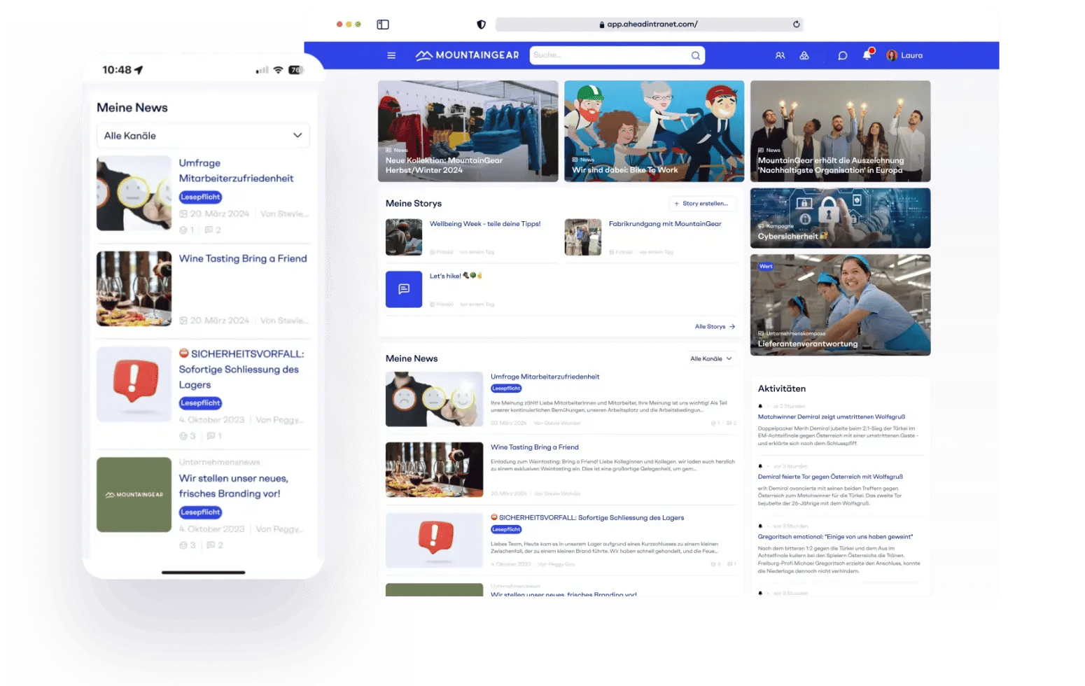
Die Intranet Plattform
Ein Intranet, das den Arbeitsalltag erleichtert
ahead bündelt Kommunikation, Beteiligung und Lernen auf einer zentralen Plattform. Mitarbeitende finden Informationen schneller, bleiben besser informiert und können sich aktiv einbringen.
-
Interne
Kommunikation -
Engagement und
Beteiligung -
Wissen und
Lernen

Erreiche Mitarbeitende mit News, Kampagnen und Updates. Inhalte lassen sich personalisieren, mehrsprachig ausspielen und auf jedem Gerät aufrufen.
- News, Stories und Kampagnen
- Zielgruppensteuerung und Personalisierung
- Mobile Mitarbeiter App für alle Teams
- Mehrsprachigkeit und automatische Übersetzung

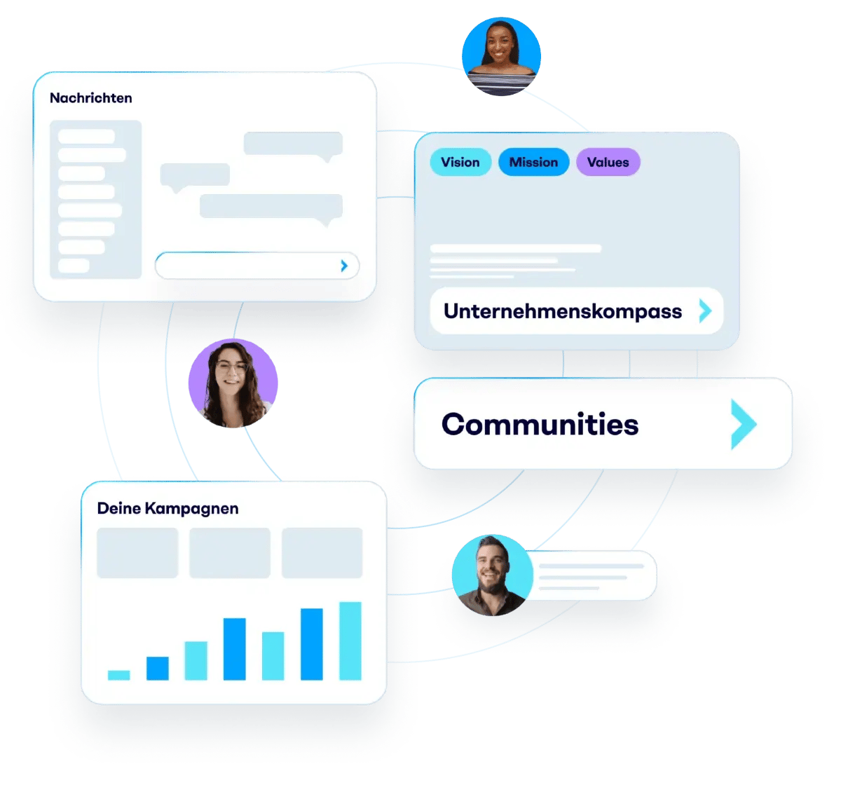
Mitarbeitende können Feedback geben, sich austauschen und aktiv zum Unternehmen beitragen. Das stärkt die Kultur und Zusammenarbeit.
- Feedback und Umfragen
- Community und Austauschformate
- Sichtbarkeit für Werte und Erfolge
- Engagement messbar machen
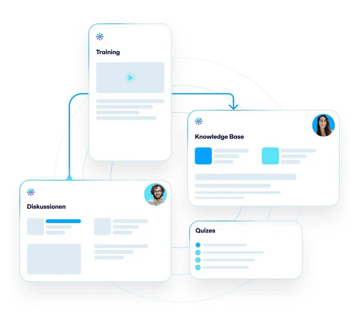
Wissen und Weiterbildung werden Teil des Arbeitsalltags. Schulungen, Inhalte und Updates stehen direkt im Intranet zur Verfügung ohne separate Lern-Systeme.
- Onboarding und Schulungen direkt in der Plattform
- Lernen kombiniert mit Kommunikation
- Mobile und mehrsprachige Lerninhalte
- Fortschritt und Teilnahme nachvollziehbar

Funktionen
Alles, was ein modernes Intranet braucht
ahead bietet alle Funktionen, die Organisationen für eine moderne interne Kommunikation benötigen von News und Kampagnen bis zur intelligenten Suche.
- Alle
- Kommunikation & Inhalte
- Communities & Social
- Wissensmanagement & Suche
- Mitarbeiter Services & Onboarding
- Plattform

News und Kampagnen
Informiere gezielt und halte alle Mitarbeitenden auf dem neuesten Stand.

Wissen und Dokumente
Macht Informationen schnell auffindbar und zentral verfügbar.

Onboarding und Lernen
Begleitet neue Mitarbeitende und vermittelt Wissen im Arbeitsalltag.

Austausch und Communities
Fördert Dialog, Feedback und Vernetzung im Unternehmen.

Insights und Analytics
Zeigt, was ankommt und wo Kommunikation verbessert werden kann.

Ask ahead (KI)
Finde Antworten aus internen Inhalten und angebundenen Systemen in Sekunden.
Ergebnisse sprechen für sich
Messbare Wirkung im Arbeitsalltag
Unternehmen nutzen ahead, um ihre Mitarbeiter effektiver zu erreichen und die interne Kommunikation messbar zu verbessern.

95%
der Mitarbeitenden waren innerhalb von 3 Monaten wöchentlich aktiv

5X
schneller bei der Erstellung von Inhalten durch automatische Übersetzung

10%
weniger Fluktuation durch mehr Transparenz bei Veränderungen
Integrationen
ahead integriert sich in bestehende Systemlandschaft
ahead lässt sich nahtlos in bestehende Tools und Plattformen integrieren. Inhalte und Informationen aus verschiedenen Systemen werden zentral zugänglich und verhindern Informationssilos.
- Nutze die Möglichkeiten der Microsoft 365 Umgebung im Intranet
- Finde Inhalte aus Drittsystemen über die zentrale Suche
- Stelle Informationen aus HR Systemen direkt im Mitarbeiterprofil bereit
- Integriere externe Inhalte oder Social Media Beiträge
- Sende Inhalte aus ahead an externe Kanäle wie Digital Signage oder MS Teams

Kundenstories
Wie Unternehmen ahead erfolgreich einsetzen
Unternehmen aus verschiedenen Branchen nutzen ahead, um ihre interne Kommunikation zu verbessern, Mitarbeitende besser zu vernetzen und Wissen zugänglich zu machen.

Kundenstories
Wie WWZ die interne Kommunikation neu elektrisiert
Von Energie bis Telekommunikation – WWZ hält die Region am Laufen. Intern bremsten jedoch veraltete Kanäle den Austausch. Erfahre, wie 530 Mitarbeitende mit einem modernen Intranet wieder besser vernetzt sind.
- > 500 Mitarbeitende
- Non Desk Mitarbeitende
- Mobile First
- Sharepoint Integration
- Kultur & Verbindung
Kundenstories
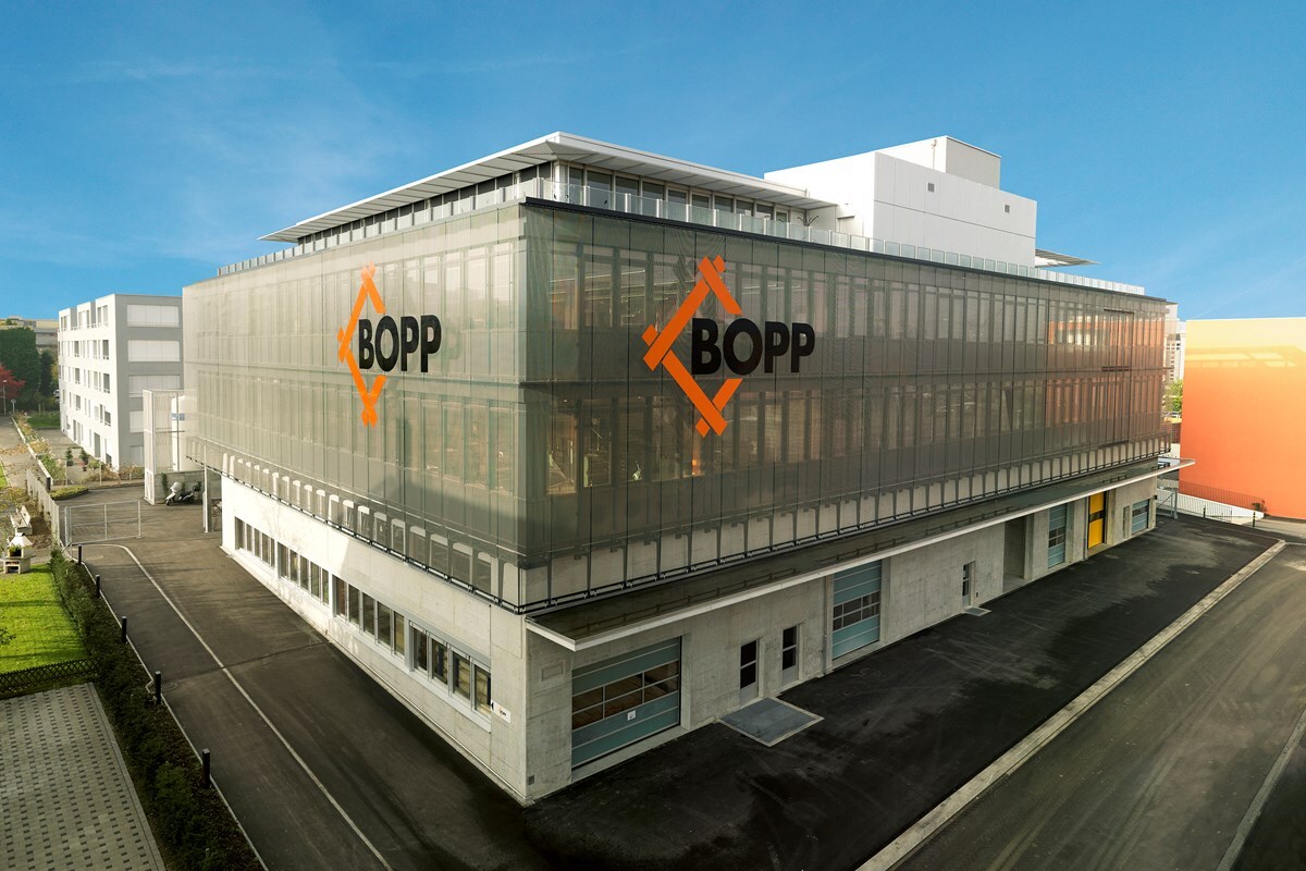
Nachhaltiges Lernen statt alter PDFs: BOPPs Arbeitsalltag
Wertvolles Wissen ist in vielen Unternehmen vorhanden aber oft schwer zugänglich, verteilt oder an einzelne Personen gebunden. Gemeinsam mit ahead und Kicken Dynamics hat BOPP einen neuen Ansatz gewählt: Lernen nicht neben der Arbeit, sondern direkt im Arbeitsalltag.
- Lernen im Arbeitsfluss
- Wissen strukturieren
- Ownership im Business


Kundenstories
Natürlich verbunden: Weleda stärkt den Group Spirit
Erfahre, wie Weleda in nur drei Monaten ein globales Intranet eingeführt hat, das Mitarbeitende in 20 Ländern verbindet, Informationsflut reduziert und den Group Spirit nachhaltig wachsen lässt.
- Globale Reichweite
- Wir-Gefühl stärken
- Schnelle Einführung
- Mehrsprachige Kommunikation

Kundenstories
ahead X Community Event 2025
Über 60 Teilnehmende trafen sich im The Circle am Flughafen Zürich, um Ideen zu teilen, voneinander zu lernen und die Kraft der Community zu erleben. Der Nachmittag bot spannende Impulse, lebendige Diskussionen und endete mit der Verleihung der ahead Awards 2025.
- Austausch von Ideen, Erkenntnissen und Best Practices
- Expertenrunden zu KI und Non-Desk-Engagement
- Auszeichnungen für das beste Onboarding und aktive Intranets


Kundenstories
Fuchs-Movesa AG geht neue Wege mit ahead Intranet
Digitaler Wandel, zentrale Plattform, gestärktes Wir-Gefühl: Wie Fuchs-Movesa AG mit ahead die interne Kommunikation modernisiert und ihre Mitarbeitenden verbindet.
- Alle Mitarbeitenden digital erreichbar
- Zentrale Plattform mit Office 365-Anbindung
- Einfache Bedienung, auch mobil
- Mehr Wir-Gefühl durch soziale Features

Kundenstories
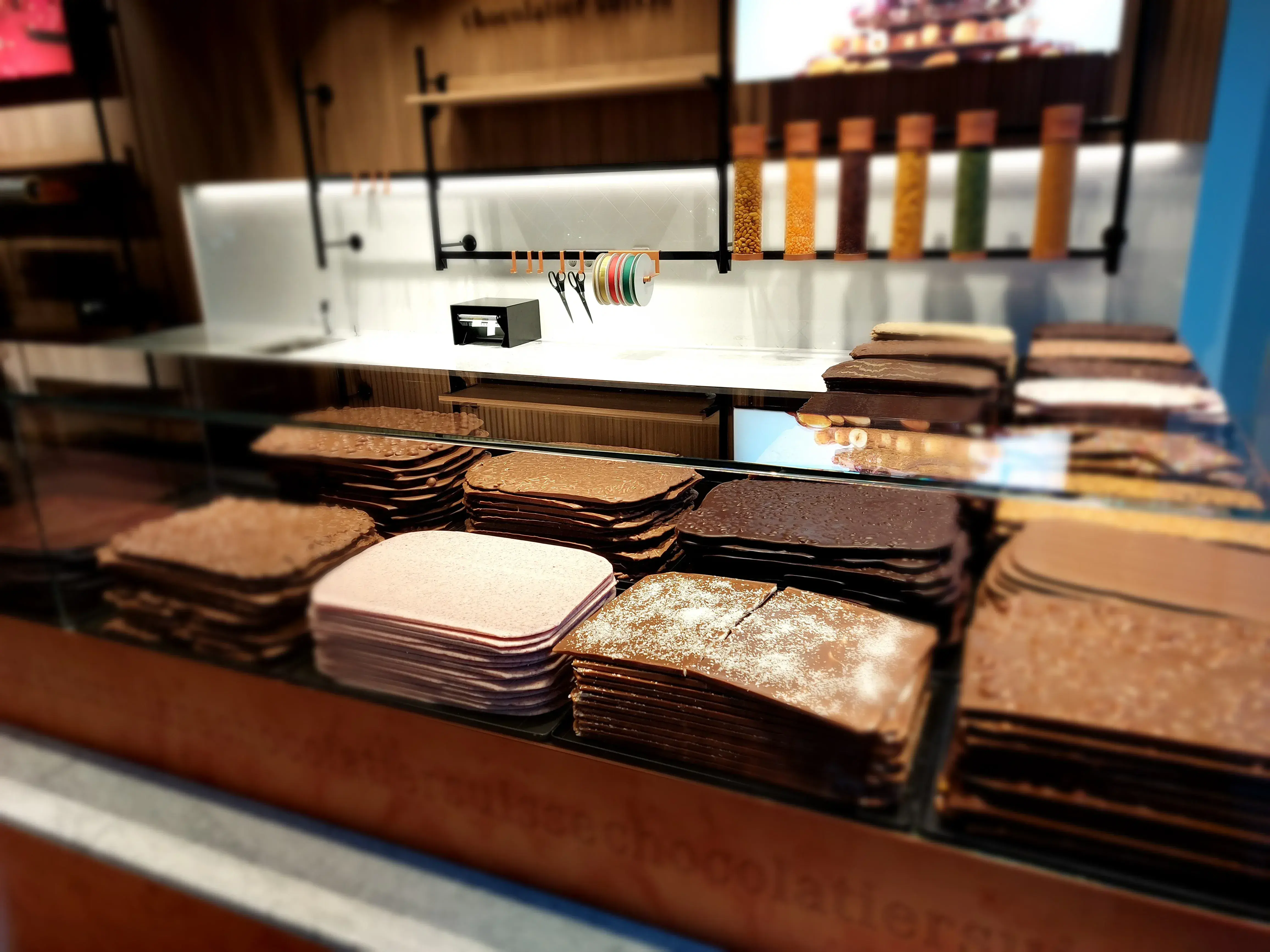
Läderachs Erfolgsrezept für die interne Kommunikation
Entdecken Sie, wie die süsse Verbindung von Schweizer Schokoladenkunst und innovativer interner Kommunikation 2500 Mitarbeitende in 18 Ländern vernetzt und motiviert hat.
- Globale Reichweite
- Mehrsprachige Kommunikation

Erlebe ahead in der Praxis
Buche eine Demo und entdecke, wie ahead alle Mitarbeiter in einer Plattform erreicht und besser verbindet.